So expect a few more character sheets soon presented a little better.
Friday, 1 October 2010
Free for change!
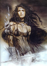
Well I like the below image to a extent however it is just too mad in a way. The background seems very harsh compared to the rest of the image. It's just almost to bright. So I'm going to start some quick research into how character artists/concept artists present their work. For one, doing this will help me achieve something more acceptable to hand in. I don't want to be handing something that looks a mess in.
Subscribe to:
Post Comments (Atom)
not too keen on the colours you used on that guy on the presentation sheet, but the sheet itself is fine Ive seen guys who are in the industry who haven't spent as much time to present their concepts and literally just scribble some faded colour behind the character.
ReplyDeletewould be quite nice if you added a bit of colour to all 3 of the larger images.